Wednesday, December 7, 2011

Humanity Monument Proposal


Humanity Monuments Proposal
Jerry Adams
The Purpose
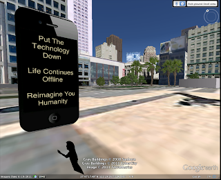
I propose to build a series of 16-foot monuments around the city. The monuments will be in the form of the popular techno-gadget, the Apple iPhone. Recently I observed my dependence on the iPhone and discovered I rely on it more than I should. Instead of interacting with the people and places around me I escaped into the tiny screen. I propose that we install the monuments at key parts of the city to remind people that instead of retreating into a digital world we can take in our surroundings and reimagine our own humanity outside of our technological advancements.
The Locations
There will be monuments in five different locations. The locations of the monuments will be in prime foot traffic locations. To get the full effect and largest impact the monuments must be seen by the largest amount of people.
Location 1: Market & Powell. This is a prime location with many retail shops and restaurants. Many people will see the monument and is a popular tourist area. This location will increase tourism in the area and will help to spread the word that the City of San Francisco is concerned with humanity and our connections with each other.
The rest of the locations will also have the same effect as the Market & Powell location. Location 2: AT&T Ballpark at King St and 3rd St. Location 3: Justin Herman Plaza near 1 Market. Location 4: Union Square Plaza. Location 5: On top of the Sutro Tower lookout in Twin Peaks.
The Cost
            Materials:
-Concrete – 16’ x 7’ x 1.5’
-168 Square Feet/Per Monument
Cost per monument - $840
Total cost for five monuments:
$4200.00
            Land Rental:
- Each monument needs 20 sq/ft for safety
- Average monthly land rental cost: $45-75
Cost per monument a month: $900-1500
Total cost for five monuments per month: $4500-7500
Three month property lease: $13,500-22,500
One Year Lease: $54,000-90,000
            Other Costs:
- Truck/Install Rental: $2500
- Wood, Re-Bar, Wire, Fasteners: $500
- Misc. Supplies/Tools: $500
Total additional costs: $3500
Total Projected Costs:
  • Cost Of Materials: $4200
  • Land Rental: $13,500-22,500
  • Other Costs: $1500
Total Projected Cost For Five Monuments:
$19,200 – 28,200 (Three Months)
$59,700-95,000 (One Year)
(Depending on Location)


Sunday, December 4, 2011

Outside Event 3

For my last outside event I visited the deYoung Museum. My purpose for visiting another time was to see the James Rosenquist is now on display. For this assignment I analysed the visual aspects of the piece and the techniques used in making this piece powerful and visually stunning.


At the de Young Museum in San Francisco hangs a James Rosenquist piece entitled Where The Water Goes (1989), from a series called Welcome To The Water Plant. The mixed media piece consists of colored pressed paper pulp and has lithographed collage elements. One of the most fascinating things about the piece is the large scale and use of paper pulp gives the piece great textural properties. Rosenquist uses the contrast of color to give depth to the piece. He uses this device to a great extent within the entire piece, giving it an almost three-dimensional feel about it.
            The most obvious quality that Rosenquist enlists is the use of line. The piece has several moving lines that point in many different locations. The top third of the piece is dominated by cutout and constructed images. Within the cutouts there is a faint image of two woman’s faces. The face on the left is more visible due to the wide smile, white teeth and ruby red lips, whereas the face on the right is merely a single eye and the corners of a mouth. The bright colors of the face cutouts are contrasted against the black and white background.
            In the very middle of the piece, one of the woman’s faces is overlapping onto a white porcelain-like image. The white porcelain area looks as if to be the bottom part of a standard urinal with water valve lines extending out from it on both sides. At the very bottom of the urinal, there is a water pipe that connects to the urinal. The pipes and vales are dark shades of grays and blacks, which contrast against the white of the urinal and the intense hues of the background. The color of the urinal and pipes are also contrasted against the dark bluish-green and bright pink hues of the background paper pulp. The use of contrasting color visually brings the urinal and pipes into the front dimension of the piece while pushing the paper pulp into the background even further, creating a space-like quality.
            At the very bottom of the piece lies a shell-like image. The bright pink background behind the shell gives the illusion of great depth between the shell and the background. Also, just above the shell and slightly to the right is another cutout image of an eye. The eye does not seem to be human and it looks as if it could be an animal’s eye. In terms of placement, the eye is laid on top of the right water valve, which pushes this eye to the very front of the painting. There seems to be a priority about the piece by placing the human image on top register and the animal eye and shell at the bottom.
            Rosenquist enlists several devices to create a space that is both apparent, by use of the title, and also allowed to be interpreted. Rosenquist sets a magical space by the use of images, color, and placement, that gives the large scale image a powerful affect. 

Improbable Monument


Thursday, November 17, 2011

Improbable Monument Ideas

So I have been battling with this idea of technology taking over people's humanity. Paranoid? Yes. I know it is kind of a crazy idea but I can't seem to stop thinking about it. For myself, I am resistant against technologies and I am leery of the ways in which people use them and how these technologies use us (i.e. Safeway Club Cards). I personally can not stand how much I depend on my phone to do anything. I pay bills, check schedules, ect., ect. It is the system in which we are living in that says"If you can't adapt to technology then you will have a difficult time doing anything."

So I wanted to do a series of monuments in the shape of an iPhone and put them around the city. Next to the monument will be the figure of a person from the waist up, who is reaching for the iPhone. Also, I wanted to make a commemorative placard to go along with it that says something witty and sarcastic about our current technological environment.

Outside(Inside) Event #2

For my second outside event, myself and an esteemed colleague vistited the de Young Museum. For different reasons we attended but never the less eventful. I wanted to see the series of Meatyard photographs that were just recently put on display there.

Meatyard has a haunting way about him that I am drawn to. Creepy masks, strange looking people and places make up the majority of the works on display. I analyzed one such photograph entitled Romance (N.) from Ambrose Bierce #3, which is a brilliant example of Meatyard's work.


Romance (N.) from Ambrose Bierce #3 (1962), is a nearly disturbing photograph by Ralph Eugene Meatyard which on display at the de Young Museum. The most interesting aspect of the print is the obvious appearance of four figures wearing creepy masks. Meatyard’s use of subject matter and position are apparent in the print.
            Scattered throughout the image are what appears to be a family of four masked figures. They are all wearing very distinctly disturbing masks and seem to be staring off in the same direction. The figure at the forefront seems to be a young boy or girl wearing an oversized apotropaic face-like mask, which adds to the effect of the imagery. The young boy/girl sitting on the step labeled 2 is sitting with it’s head resting on it’s hand with the mask overlapping the hand and the mask seems to look like the face has been burnt on one side.  There is an older figure sitting on the step labeled 3 and the mask is abnormally puffed out and sagging. The figure in the far back is sitting on the step labeled 5 with the mask resting on her lap (assuming by the skirt that ‘she’ is in fact she).
            Although the figure within the image are offset and scattered, the image itself seems to be aligned to the stairs themselves. Perfectly in the middle of the image, the stairs ascend from the very forefront and continue off the borders of the image. By the numbers marking the steps, it looks as though the figures are sitting on bleachers at a sporting event.
            The background setting is somewhat non-descript but it looks as if it could be a sports arena or some kind of place for public sports. The steps are numbered and ascend up which can be row assignments. Also, there seems to be two steps for every bleacher seat, making the seating area twice as tall as each step.
            Meatyard is a master of tone. The low and high tones of the image are brilliantly decided and add the effect of the image. The figure sitting on step 3 has a stark white shirt that contrasts against the dark tones surrounding him. At the very top is the very first eye-drawing true black.  Also every figure within the image has an element of true black attached. The younger figures have true black in the shoes and pants, while the figure on step 3 has only true black in the shoes and the figure on step 5 is nearly all true black from the skirt up.
            Meatyard uses creepy figures and the contrast of tones in order to convey the intended feel. Although the prints are fairly small in scale (about 8in x 8in), this forces the viewer to get close to the image in order to fully inspect the image. The scale of the image creates a very intimate environment in which the characters in the image live. Overall, the device of tone, subject, place, and the sheer oddity of this print make it a brilliant piece of photographic history. 

Wednesday, November 9, 2011

Outside Event: Matt Keegan


For my first outside assignment, I attended a lecture and showing by New York artist Matt Keegan. The lecture was held in the Fine Arts building on San Francisco State University. He presented his work in a slide show presentation and spoke about his previous and current work.
His work and ideas span throughout the spectrum of creative conception but somehow brings it all back together to form a cohesive collection, which spans across many mediums. Painting, sculpture, photography, instillations pieces, and book arts, are some of the ways in which he expresses his work through.
Keegan spoke about his upbringing in New York and also his time in San Francisco. He did a show that was influenced by San Francisco while he was living here. Compared to his connection with New York and the current exhibit he out together about New York, his San Francisco collection, he considered, more tourist-like. As San Francisco was not a familiar place for him, the outcome of his work about SF came out being more of a travelogue of his adventures here. Some of the photos he showed of the work looked as if they had been taken out of someone’s photo album.
 Although he enjoyed the tourist feel of the San Francisco exhibit, he wanted his New York exhibit to have the feel of New York. Some of the sculptures he showed were painted sheet metal that had been folded and bended into random shapes. But what makes these sculptures unique to New York is that the sculptures were painted in the municipal colors of the bridges that connect the five boroughs of New York. When I first viewed the sculptures I thought the colors of the sculptures were bland and distracted from the rest of the show. But upon learning that the sculptures were the municipal colors of New York bridges, the meaning and cleverness of the pieces were evident and brought the entire show together in a way. I would assume that if I were from New York I would instantly recognize the color of the pieces thus the impact of the pieces would be more easily read.
Another really fascinating project that he embarked upon was a tabletop piece called Flash Cards. Keegan’s mother teaches English as a second language to mostly Spanish speaking individuals. She would cut out pictures from magazines and newspapers and then assign a word to the image. The piece is about the slippery nature of language. One of the images on one of the cards was a picture of Burt Reynolds and I believe the word that was assigned to the image was “Mainly”. These cards are brilliantly funny and I would live to see them in person.
One the biggest things that I took away from his lecture was his education. His education comes through in his work because he didn’t have a concentration throughout his undergrad or grad work. He was allowed to follow a plan that made him well rounded in many different aspects of art mediums.

Tuesday, November 8, 2011

Cross Boarder Project Evaluation


- Overall - what worked/what was a challenge
I think that the biggest difficulty was matching up our schedules with our Canadian counterparts. Since we didn't have a designated time to meet and discuss things, as if we were in the same class, it made it difficult to share more ideas. Also Google Earth is one of the worst programs I have ever had to use. It is a brilliant concept but the technology isn't there yet. We had several technical difficulties. 
- how your group managed the "cross-border logistics" of communication, exchange of ideas, coming up with an idea, coordinating project parts?
It was fairly smooth. We devised a plan for them to complete and then they sent us a plan. KMZ files were exchanged and not much communication was exchanged. We had one Skype session between Erim, Phil, and myself, but that was spent putting together the final pieces for the preliminary maps.
- Suggestions on how to address some of the challenges and ways to strengthen the collaboration
Convince Google to work on their software! But other than that I woud say that the assignment needed more explanation before the undertaking. It seemed like on both sides of the border, that no one really knew what the project needed to be. We scraped together what we thought was the idea behind the project and ran with it. Maybe more examples of previous students works. 
- What you gained?
I learned about the topography and location of things in Vancouver as well as places I have never been to in SF. It was a great experience seeing things that the Canadians and ourselves have never seen before. 
-If you were to do it again, what would you do differently?
I would spend more time conceptualizing the piece and making it more cohesive as an idea instead of a sightseeing trip. Since we spent most of our time trying to figure out what we needed to do and dealing with technical issues, we had little time to come up with an idea to push the project even further. Most of our time was spent doing research on a city we knew nothing about. Overall it was a great project and fun to do, despite the technical difficulties.