Wednesday, December 7, 2011

Humanity Monument Proposal


Humanity Monuments Proposal
Jerry Adams
The Purpose
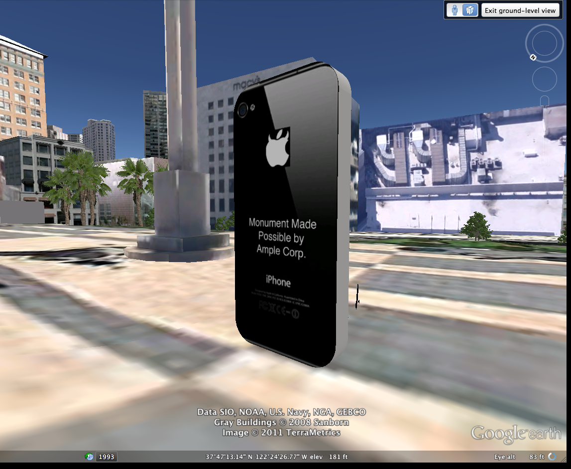
I propose to build a series of 16-foot monuments around the city. The monuments will be in the form of the popular techno-gadget, the Apple iPhone. Recently I observed my dependence on the iPhone and discovered I rely on it more than I should. Instead of interacting with the people and places around me I escaped into the tiny screen. I propose that we install the monuments at key parts of the city to remind people that instead of retreating into a digital world we can take in our surroundings and reimagine our own humanity outside of our technological advancements.
The Locations
There will be monuments in five different locations. The locations of the monuments will be in prime foot traffic locations. To get the full effect and largest impact the monuments must be seen by the largest amount of people.
Location 1: Market & Powell. This is a prime location with many retail shops and restaurants. Many people will see the monument and is a popular tourist area. This location will increase tourism in the area and will help to spread the word that the City of San Francisco is concerned with humanity and our connections with each other.
The rest of the locations will also have the same effect as the Market & Powell location. Location 2: AT&T Ballpark at King St and 3rd St. Location 3: Justin Herman Plaza near 1 Market. Location 4: Union Square Plaza. Location 5: On top of the Sutro Tower lookout in Twin Peaks.
The Cost
            Materials:
-Concrete – 16’ x 7’ x 1.5’
-168 Square Feet/Per Monument
Cost per monument - $840
Total cost for five monuments:
$4200.00
            Land Rental:
- Each monument needs 20 sq/ft for safety
- Average monthly land rental cost: $45-75
Cost per monument a month: $900-1500
Total cost for five monuments per month: $4500-7500
Three month property lease: $13,500-22,500
One Year Lease: $54,000-90,000
            Other Costs:
- Truck/Install Rental: $2500
- Wood, Re-Bar, Wire, Fasteners: $500
- Misc. Supplies/Tools: $500
Total additional costs: $3500
Total Projected Costs:
  • Cost Of Materials: $4200
  • Land Rental: $13,500-22,500
  • Other Costs: $1500
Total Projected Cost For Five Monuments:
$19,200 – 28,200 (Three Months)
$59,700-95,000 (One Year)
(Depending on Location)


Sunday, December 4, 2011

Outside Event 3

For my last outside event I visited the deYoung Museum. My purpose for visiting another time was to see the James Rosenquist is now on display. For this assignment I analysed the visual aspects of the piece and the techniques used in making this piece powerful and visually stunning.


At the de Young Museum in San Francisco hangs a James Rosenquist piece entitled Where The Water Goes (1989), from a series called Welcome To The Water Plant. The mixed media piece consists of colored pressed paper pulp and has lithographed collage elements. One of the most fascinating things about the piece is the large scale and use of paper pulp gives the piece great textural properties. Rosenquist uses the contrast of color to give depth to the piece. He uses this device to a great extent within the entire piece, giving it an almost three-dimensional feel about it.
            The most obvious quality that Rosenquist enlists is the use of line. The piece has several moving lines that point in many different locations. The top third of the piece is dominated by cutout and constructed images. Within the cutouts there is a faint image of two woman’s faces. The face on the left is more visible due to the wide smile, white teeth and ruby red lips, whereas the face on the right is merely a single eye and the corners of a mouth. The bright colors of the face cutouts are contrasted against the black and white background.
            In the very middle of the piece, one of the woman’s faces is overlapping onto a white porcelain-like image. The white porcelain area looks as if to be the bottom part of a standard urinal with water valve lines extending out from it on both sides. At the very bottom of the urinal, there is a water pipe that connects to the urinal. The pipes and vales are dark shades of grays and blacks, which contrast against the white of the urinal and the intense hues of the background. The color of the urinal and pipes are also contrasted against the dark bluish-green and bright pink hues of the background paper pulp. The use of contrasting color visually brings the urinal and pipes into the front dimension of the piece while pushing the paper pulp into the background even further, creating a space-like quality.
            At the very bottom of the piece lies a shell-like image. The bright pink background behind the shell gives the illusion of great depth between the shell and the background. Also, just above the shell and slightly to the right is another cutout image of an eye. The eye does not seem to be human and it looks as if it could be an animal’s eye. In terms of placement, the eye is laid on top of the right water valve, which pushes this eye to the very front of the painting. There seems to be a priority about the piece by placing the human image on top register and the animal eye and shell at the bottom.
            Rosenquist enlists several devices to create a space that is both apparent, by use of the title, and also allowed to be interpreted. Rosenquist sets a magical space by the use of images, color, and placement, that gives the large scale image a powerful affect. 

Improbable Monument


Thursday, November 17, 2011

Improbable Monument Ideas

So I have been battling with this idea of technology taking over people's humanity. Paranoid? Yes. I know it is kind of a crazy idea but I can't seem to stop thinking about it. For myself, I am resistant against technologies and I am leery of the ways in which people use them and how these technologies use us (i.e. Safeway Club Cards). I personally can not stand how much I depend on my phone to do anything. I pay bills, check schedules, ect., ect. It is the system in which we are living in that says"If you can't adapt to technology then you will have a difficult time doing anything."

So I wanted to do a series of monuments in the shape of an iPhone and put them around the city. Next to the monument will be the figure of a person from the waist up, who is reaching for the iPhone. Also, I wanted to make a commemorative placard to go along with it that says something witty and sarcastic about our current technological environment.

Outside(Inside) Event #2

For my second outside event, myself and an esteemed colleague vistited the de Young Museum. For different reasons we attended but never the less eventful. I wanted to see the series of Meatyard photographs that were just recently put on display there.

Meatyard has a haunting way about him that I am drawn to. Creepy masks, strange looking people and places make up the majority of the works on display. I analyzed one such photograph entitled Romance (N.) from Ambrose Bierce #3, which is a brilliant example of Meatyard's work.


Romance (N.) from Ambrose Bierce #3 (1962), is a nearly disturbing photograph by Ralph Eugene Meatyard which on display at the de Young Museum. The most interesting aspect of the print is the obvious appearance of four figures wearing creepy masks. Meatyard’s use of subject matter and position are apparent in the print.
            Scattered throughout the image are what appears to be a family of four masked figures. They are all wearing very distinctly disturbing masks and seem to be staring off in the same direction. The figure at the forefront seems to be a young boy or girl wearing an oversized apotropaic face-like mask, which adds to the effect of the imagery. The young boy/girl sitting on the step labeled 2 is sitting with it’s head resting on it’s hand with the mask overlapping the hand and the mask seems to look like the face has been burnt on one side.  There is an older figure sitting on the step labeled 3 and the mask is abnormally puffed out and sagging. The figure in the far back is sitting on the step labeled 5 with the mask resting on her lap (assuming by the skirt that ‘she’ is in fact she).
            Although the figure within the image are offset and scattered, the image itself seems to be aligned to the stairs themselves. Perfectly in the middle of the image, the stairs ascend from the very forefront and continue off the borders of the image. By the numbers marking the steps, it looks as though the figures are sitting on bleachers at a sporting event.
            The background setting is somewhat non-descript but it looks as if it could be a sports arena or some kind of place for public sports. The steps are numbered and ascend up which can be row assignments. Also, there seems to be two steps for every bleacher seat, making the seating area twice as tall as each step.
            Meatyard is a master of tone. The low and high tones of the image are brilliantly decided and add the effect of the image. The figure sitting on step 3 has a stark white shirt that contrasts against the dark tones surrounding him. At the very top is the very first eye-drawing true black.  Also every figure within the image has an element of true black attached. The younger figures have true black in the shoes and pants, while the figure on step 3 has only true black in the shoes and the figure on step 5 is nearly all true black from the skirt up.
            Meatyard uses creepy figures and the contrast of tones in order to convey the intended feel. Although the prints are fairly small in scale (about 8in x 8in), this forces the viewer to get close to the image in order to fully inspect the image. The scale of the image creates a very intimate environment in which the characters in the image live. Overall, the device of tone, subject, place, and the sheer oddity of this print make it a brilliant piece of photographic history. 

Wednesday, November 9, 2011

Outside Event: Matt Keegan


For my first outside assignment, I attended a lecture and showing by New York artist Matt Keegan. The lecture was held in the Fine Arts building on San Francisco State University. He presented his work in a slide show presentation and spoke about his previous and current work.
His work and ideas span throughout the spectrum of creative conception but somehow brings it all back together to form a cohesive collection, which spans across many mediums. Painting, sculpture, photography, instillations pieces, and book arts, are some of the ways in which he expresses his work through.
Keegan spoke about his upbringing in New York and also his time in San Francisco. He did a show that was influenced by San Francisco while he was living here. Compared to his connection with New York and the current exhibit he out together about New York, his San Francisco collection, he considered, more tourist-like. As San Francisco was not a familiar place for him, the outcome of his work about SF came out being more of a travelogue of his adventures here. Some of the photos he showed of the work looked as if they had been taken out of someone’s photo album.
 Although he enjoyed the tourist feel of the San Francisco exhibit, he wanted his New York exhibit to have the feel of New York. Some of the sculptures he showed were painted sheet metal that had been folded and bended into random shapes. But what makes these sculptures unique to New York is that the sculptures were painted in the municipal colors of the bridges that connect the five boroughs of New York. When I first viewed the sculptures I thought the colors of the sculptures were bland and distracted from the rest of the show. But upon learning that the sculptures were the municipal colors of New York bridges, the meaning and cleverness of the pieces were evident and brought the entire show together in a way. I would assume that if I were from New York I would instantly recognize the color of the pieces thus the impact of the pieces would be more easily read.
Another really fascinating project that he embarked upon was a tabletop piece called Flash Cards. Keegan’s mother teaches English as a second language to mostly Spanish speaking individuals. She would cut out pictures from magazines and newspapers and then assign a word to the image. The piece is about the slippery nature of language. One of the images on one of the cards was a picture of Burt Reynolds and I believe the word that was assigned to the image was “Mainly”. These cards are brilliantly funny and I would live to see them in person.
One the biggest things that I took away from his lecture was his education. His education comes through in his work because he didn’t have a concentration throughout his undergrad or grad work. He was allowed to follow a plan that made him well rounded in many different aspects of art mediums.

Tuesday, November 8, 2011

Cross Boarder Project Evaluation


- Overall - what worked/what was a challenge
I think that the biggest difficulty was matching up our schedules with our Canadian counterparts. Since we didn't have a designated time to meet and discuss things, as if we were in the same class, it made it difficult to share more ideas. Also Google Earth is one of the worst programs I have ever had to use. It is a brilliant concept but the technology isn't there yet. We had several technical difficulties. 
- how your group managed the "cross-border logistics" of communication, exchange of ideas, coming up with an idea, coordinating project parts?
It was fairly smooth. We devised a plan for them to complete and then they sent us a plan. KMZ files were exchanged and not much communication was exchanged. We had one Skype session between Erim, Phil, and myself, but that was spent putting together the final pieces for the preliminary maps.
- Suggestions on how to address some of the challenges and ways to strengthen the collaboration
Convince Google to work on their software! But other than that I woud say that the assignment needed more explanation before the undertaking. It seemed like on both sides of the border, that no one really knew what the project needed to be. We scraped together what we thought was the idea behind the project and ran with it. Maybe more examples of previous students works. 
- What you gained?
I learned about the topography and location of things in Vancouver as well as places I have never been to in SF. It was a great experience seeing things that the Canadians and ourselves have never seen before. 
-If you were to do it again, what would you do differently?
I would spend more time conceptualizing the piece and making it more cohesive as an idea instead of a sightseeing trip. Since we spent most of our time trying to figure out what we needed to do and dealing with technical issues, we had little time to come up with an idea to push the project even further. Most of our time was spent doing research on a city we knew nothing about. Overall it was a great project and fun to do, despite the technical difficulties.

Tuesday, October 25, 2011

Google Earth Project

I am thinking that a great idea would be to map out our day on Google Earth. Throughout a given day we will take pictures of ourselves and the surroundings and pinpoint them on Google Earth. So any significant event in our day will be documented and locate it on Google maps.

Tuesday, September 27, 2011

Logo Jamming


I decided to post my logos in a space that I felt was a suitable for the logo I altered. Even though I picked a logo that isn't exactly a poke at the brand so after thinking about the logo I decided to explore other ways in which I could use the logo. Having recently discovered the downstairs portion of the Ceasar Chaves building I found that there is a bar on campus and after a couple of days of scouting other spots, I decided to make this my place in which to post. 

I am not really sure why the college has a bar on campus and it strikes me as odd that they would. Sure I like to drink as much as the next guy but I don't want to have to deal with that while I'm at school. There is always the temptationi to skip class and grab a beer. Sure it is a test in self-control but still and why not be able to bring booze to class as well. 

So they got jammed!

Mock 1 & Before


Thursday, September 22, 2011

Thoughts on Culture Jamming

I find myself being drawn toward the culture jamming article by Mark Dery. It frustrates me however that more artist are not going through with such projects. Art is suppose to be the commentary upon which modern times are examined. Such ideas should be expanded.

"Dwindling funds for public schools and libraries, counterpointed by the skyrocketing sales of VCRs and electronic games, have given rise to a culture of "aliteracy," defined by Roger Cohen as "the rejection of books by children and young adults who know how to read but choose not to." The drear truth that two thirds of Americans get "most of their information" from television is hardly a revelation."

We know that this is happening yet little is to be done against the ad campaigns of big industry who is in affect creating a more "aliterate" culture. The rules have changed and steps must be taken to reach people to the danger of fully digitalized media.

Martin A. Lee and Norman Solomon level another, equally disturbing charge:

In an era of network news cutbacks and staff layoffs, many reporters are reluctant to pursue stories they know will upset management. "People are more careful now," remarked a former NBC news producer, "because this whole notion of freedom of the press becomes a contradiction when the people who own the media are the same people who need to be reported on."

Tuesday, September 20, 2011

Extended Body

Lisa Bufano is a dancer and performing artist who has gone through bilateral below knee and finger amputation. Here is a performance from “Five Open Mouths” in which she wears some extremely awesome prosthetic springing feet. Hit the jump for a shot of her another one of her setups—a spider-like four-appendage extension. 


http://www.coroflot.com/kaylenek?city=Seattle&specialty=4&

 http://gajitz.com/super-flexible-prosthetic-leg-shows-womens-personal-style/


Outfeet_Aviya Serfaty from aviyaya on Vimeo.

http://www1.uni-ak.ac.at/industrialdesign/joomla/index.php?option=com_projectmanagment&typ=project_single&project=104&media=3


http://www1.uni-ak.ac.at/industrialdesign/joomla/index.php?option=com_projectmanagment&typ=project_single&project=28&media=1


na:vi is a GPS navigating system for the blind people. It helps them to stay oriented in every situation without having to use the white cane or
a guiding dog. A combination of modern technology
- guiding gyroscopes, laser range finder together with the GPS navigation with 3 dimensional user interface and elegant design.
 
http://www1.uni-ak.ac.at/industrialdesign/joomla/index.php?option=com_projectmanagment&typ=project_single&project=89&media=1

Thursday, September 15, 2011

Art by Chance:

Stabbed Wife Miserably Blinked
Novel used: The Convalescent by Jessica Anthony

Tuesday, September 13, 2011

iPod Symphony

iPod Symphony

1. Start by selecting an artist that starts with the first letter of your middle name.

2. Select the first iPod. From there, scroll 3 full rotations and select that artist.
Pick the first album and then play the 4th song in there.

3. On the 2nd iPod, scroll to the first artist that starts with the last letter of your last name, scroll
up one full rotation. Select the first album, simultaneously pause the first
iPod and play the second iPod. Once finding the new song, let the other song
play for approximately 10 more seconds before switching.

4. Continue using the same transition when switching between songs.

5. 1st iPod, select new artist, scroll 3 full rotations, select 1st album, select 2nd
song.

6. 2nd iPod, select new artist, scroll 5 full rotations, select 1st album, select 3rd
song.

7. 1st iPod, select new artist, scroll 4 full rotations, select 1st album, select 5th
song.

8. 2nd iPod, select new artist, scroll 3 full rotations, select 1st album, select 1st
song.

9. 1st iPod, select new artist, scroll 2 full rotations, select 1st album, select 4th
song.

10. 2nd iPod, select new artist, scroll 1 full rotations, select 1st album, select 2nd
song.

11. 1st iPod, select new artist, scroll ½ a rotation, select 1st album, select 1st song.

12. 2nd iPod, select new artist, scroll 3 full rotations, select 1st album, 7th song.

13. 1st iPod, select new artist, scroll 4 full rotations, select 1st album, select 9th
song.

14. 2nd iPod, select new artist, scroll 2 full rotations, select 1st album, select 5th
song.

15. 1st iPod, select new artist, scroll 5 full rotations, select 1st album, select 3rd

Johnnie Walker Bomb


Thursday, September 8, 2011

Culture Jamming

Some great quotes from 'Culture Jamming: Hacking, Slashing and Sniping in the Empire of Signs' by Mark Dery
------------------------------------------------------------------------
"Dwindling funds for public schools and libraries, counterpointed by the skyrocketing sales of VCRs and electronic games, have given rise to a culture of "aliteracy," defined by Roger Cohen as "the rejection of books by children and young adults who know how to read but choose not to." The drear truth that two thirds of Americans get "most of their information" from television is hardly a revelation."
------------------------------------------------------------------------
"The effects of television are most deleterious in the realms of journalism and politics; in both spheres, TV has reduced discourse to photo ops and sound bites, asserting the hegemony of image over language, emotion over intellect."


------------------------------------------------------------------------

Martin A. Lee and Norman Solomon level another, equally disturbing charge:
In an era of network news cutbacks and staff layoffs, many reporters are reluctant to pursue stories they know will upset management. "People are more careful now," remarked a former NBC news producer, "because this whole notion of freedom of the press becomes a contradiction when the people who own the media are the same people who need to be reported on."
------------------------------------------------------------------------

Meanwhile, the question remains: How to box with shadows? In other words, what shape does an engaged politics assume in an empire of signs?

The answer lies, perhaps, in the "semiological guerrilla warfare" imagined by Umberto Eco. "[T]he receiver of the message seems to have a residual freedom: the freedom to read it in a different way...I am proposing an action to urge the audience to control the message and its multiple possibilities of interpretation," he writes. "[O]ne medium can be employed to communicate a series of opinions on another medium...The universe of Technological Communication would then be patrolled by groups of communications guerrillas, who would restore a critical dimension to passive reception."

Eco assumes, a priori, the radical politics of visual literacy, an idea eloquently argued by Stuart Ewen, a critic of consumer culture. "We live at a time when the image has become the predominant mode of public address, eclipsing all other forms in the structuring of meaning," asserts Ewen. "Yet little in our education prepares us to make sense of the rhetoric, historical development or social implications of the images within our lives." In a society of heat, light and electronic poltergeists- --an eerie otherworld of "illimitable vastness, brilliant light, and the gloss and smoothness of material things"---the desperate project of reconstructing meaning, or at least reclaiming that notion from marketing departments and P.R. firms, requires visually-literate ghostbusters.

http://project.cyberpunk.ru/idb/culture_jamming.html

Tuesday, September 6, 2011

Some Logo Thoughts


Johnny Walker - Logo Design History


Originally known as Walker's Kilmarnock Whisky, the brand is a legacy left by John 'Johnnie' Walker after he started to sell whisky in his grocer's shop in Ayrshire, Scotland. The brand became popular, but it was his son Alexander Walker and grandson Alexander Walker II who were largely responsible for establishing the whisky as a widely popular brand. Black Label and Green Label Pure Malt

Walker died in 1857, but his legacy was assured as the Walker family developed the business and grew the Johnnie Walker brand to become world famous.

Alexander Walker first introduced the iconic square bottle in 1870. The other identifying characteristic of the bottle is the label, which is applied at an angle of 24 degrees.

In 1908, when James Stevenson was the Managing Director, there was a rebranding of sorts. The whisky was renamed from Walker's Kilmarnock Whiskies to Johnnie Walker Whisky. In addition, the slogan, "Born 1820 - Still going Strong!" was created, along with the Striding Man, a figure used in their advertisements for around fifty years. Commercial artist Tom Browne created an image of a man wearing a red coat with tails, a top hat, quizzing glass (or monocle) and Hessian boots, and carrying a cane. It was created in the likeness of company founder John Walker

Branding Tips - LogoMojo.com

http://www.logomojo.com/best-logos/johnny-walker-logo-design-history

Wednesday, August 24, 2011

Solar Powered Pitches

So these guys are pretty much out of their minds. They have somehow found a way, creating their own circuitry, to harness the power of solar panels. The have created technologies that turn solar panel frequencies into a viable sound. SolarDuo has created a new and even unforeseen way to make sound. I love the idea of misusing, or re-appropriating, uncommon objects in order to make sound and these guys have carved a piece of the sun in the name of obscurity and sound.

An excerpt from their website:
Project began during a workshop in 2003 at Media Lab Helsinki when Koray Tahiroglu & Joni Lyytikainen tried to connect a solar panel directly to a sound mixer, however; they discovered that more electric components were needed to achieve different sound structures from a solar panel. They created circuits that are based on the example by Ralf Schreiber, which inspired them to create their own solar panel instruments.

 http://mlab.uiah.fi/~korayt/solarduoprj.html

I Love Me A Noise Maker

God, I get giddy when I see a new synth or workstation with pretty knobs. The idea of taking a sound and reshaping it with a turn is simply magical and Buchla and Associates have definitely given me something to dream about. Expanding upon the popular Moog workstation synths, Buchla has definitely created a new more interactive, and more complicated, system of circuits and relays that would be thrilling for even Brian Eno. They are reshaping the future of synthesized sound circuitry(and it looks pretty, mom can I have one, this one is only $21,875).


http://www.buchla.com/series200e.html

David Claerbout the Moving Still Image

David Claerbout is moving forward in the world of still images. While using creative digital technologies he creates stunning images with moving components within the still frame. In the current exhibit the SF MoMA, Claerbout has installed two different galleries with three projectors in each room. In one of the pieces he shows a still image of children playing around a tree. Not much you might think but within the still image there is moving pieces inside of the image. While the children are locked in time, you can see the branches of the tree swaying and the children's hair blowing in the wind.
From the SF MoMA exhibit website:
The ambiguous relationships between photography and cinema, stillness and motion, historical past and perpetual present are the subjects and substance of David Claerbout's contemplative video installations. The Belgian artist manipulates cinematic time, often depicting a single moment analyzed from multiple camera perspectives; at SFMOMA he presents a quartet of projections that explore the shifts in attention between the narrative scene in the foreground and the underlying social context of the architectural background. In its U.S. premiere, The American Room (2009-10) constructs and navigates the physical and political space of a formal concert. Also featured are Sections of a Happy Moment (2007) and Kindergarten Antonio Sant'Elia 1932 (1998), both built from photographic images of children's play; and White House (2005), which repeatedly reenacts a 10-minute violent confrontation over the course of a day.

This video-installation is based on a photograph dating from 1932, at the opening of the new kindergarten Antonio Sant’Elia in Como. We see children play in the school's functionalist garden (architect Giuseppe Terragni). The light is cold and it seems like the sun is low, creating long shadows of early spring.
The image of the children remains in between a spontaneously captured moment and a composed picture. The movement of the young trees suggests that the image is frozen, while it simultaneously continues to melt further into motion, undecided in which direction to go.

(Excerpt is taken from the Artist's web-site)


SFMOMA | Exhibitions + Events | Calendar | David Claerbout: Architecture of Narrative